Description: Play with PhDs awarded in the US dataset. Do some analysis in pandas. Make a dashboard visualization of a few interesting aspects of the data using streamlit.
About Dataset
Data presented in Doctorate Recipients from U.S. Universities: 2017 were collected by the Survey of Earned Doctorates (SED). The Survey collects data on the number and characteristics of individuals receiving research doctoral degrees from U.S. academic institutions. There are 72 tables in total in this dataset. In this blog, we only explore few of them and play with dashboard tool – streamlit.
What is Streamlit?
If you are a non-tech person who is looking for a way to build your own interactive dashboard, you can consider Streamlit.
Streamlit is an open python package that helps you make deployable interactive web apps without any knowledge of HTML or CSS, etc. Python is all you need. The great thing about Streamlit is that it can automatically refresh your web apps whenever the source codes have their inputs changed.
There are numerous visualization libraries that Streamlit supports for building interactive dashboards, such as Plotly, Altair, Bokeh, etc., With these, telling a story through bar, pie, line charts, etc., has never been simpler.
Get started
In order to use Streamlit, you have to install it first by using the command:
Pip install streamlit
Now, if you want to explore the samples of Streamlit dashboards, let’s open command window and type
Streamlit hello
You can have your first glance at Streamlit visualizations by exploring different demos listed on the “Welcome to Streamlit” page, which is run at a local URL.
Dashboard building
Let’s begin to create the dash by first importing some required libraries:
import streamlit as st
import pandas as pd
import numpy as np
from plotly import tools
import plotly.offline as py
import plotly.express as px
from plotly.subplots import make_subplots
import plotly.graph_objects as go
import matplotlib.pyplot as plt
Preparing my dataset, here I used sed17-sr-tab005.xlsx:
df = pd.read_excel('data_tables/sed17-sr-tab005.xlsx')
df = df[2:]
df.columns = df.iloc[0]
df = df.drop(df.index[0])
df_ = pd.read_csv('https://raw.githubusercontent.com/plotly/datasets/master/2011_us_ag_exports.csv')
df_code = df_[['code','state']]
result = pd.merge(df, df_code, how='inner', left_on='State or location', right_on='state')
result.head()
| State or location | Rank | Doctorate recipients | code | state | |
|---|---|---|---|---|---|
| 0 | California | 1 | 6105 | CA | California |
| 1 | Texas | 2 | 4068 | TX | Texas |
| 2 | New York | 3 | 4064 | NY | New York |
| 3 | Massachusetts | 4 | 2879 | MA | Massachusetts |
| 4 | Pennsylvania | 5 | 2628 | PA | Pennsylvania |
Now, the first step is to name your dashboard and give it a description. Below is a simple one:
st.title("**♟**PhDs Dataset Exploration**♟**")
st.write("Data presented in *Doctorate Recipients from U.S. Universities:* *2017* were collected by the Survey of Earned Doctorates (SED). The Survey collects data on the number and characteristics of individuals receiving research doctoral degrees from U.S. academic institutions. There are 72 tables in total in this dataset.")
Next, people might get curious about how my data frame looks, so I will set an option for everyone to select the availability of my data frame.
if st.checkbox('Show dataframe'):
	st.write(df)
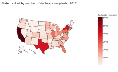
Choropleth map
It is time to build the graphs to tell the story. Let’s do some visualizations.
fig = go.Figure(data=go.Choropleth(
    locations=result['code'], # Spatial coordinates
    z = result['Doctorate recipients'].astype(float), # Data to be color-coded
    locationmode = 'USA-states', # set of locations match entries in `locations`
    colorscale = 'Reds',
    colorbar_title = "Number of Doctorate recipients",
))

fig.update_layout(
    title_text = 'State, ranked by number of doctorate recipients: 2017',
    geo_scope='usa', # limite map scope to USA
)
Here, I built a choropleth map to discribe the number of doctorate recipients from U.S. universities by states.
Second, I used sed17-sr-tab006.xlsx:
df_6 = pd.read_excel('data_tables/sed17-sr-tab006.xlsx')
df_6 = df_6.iloc[2:5,1:]
subjects = df_6.iloc[0].dropna().to_list()
sex = ['Male','Female']
df_male = df_6.iloc[2].to_list()[::2]
df_female = df_6.iloc[2].to_list()[1::2]
df_6 = pd.DataFrame({'Male': df_male,'Female': df_female},index=subjects)
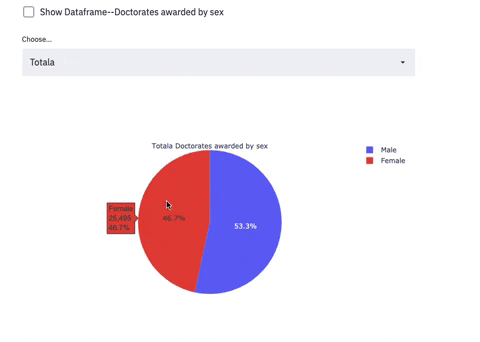
Pie charts with Selectbox
if st.checkbox('Show Dataframe--Doctorates awarded by sex'):
  st.write(df_6)

selected_metrics_2 = st.selectbox(
  label="Choose...", options=subjects
)

fig = go.Figure()
for i in subjects:
  if selected_metrics_2 == i:
  	fig = go.Figure(data=[go.Pie(labels=sex, values=df_6.loc[i],title= i+' Doctorates awarded by sex')])

st.plotly_chart(fig, use_container_width=**True**)
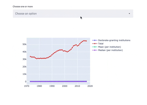
Third, I used sed17-sr-tab002.xlsx:
df_2 = pd.read_excel('data_tables/sed17-sr-tab002.xlsx')
df_2 = df_2.iloc[4:,:]
df_2.columns = ['Year','Doctorate-granting institutions','Total','Mean (per institution)','Median (per institution)']

Year = list(df_2.Year)

df_2 = df_2.iloc[:,1:]

if st.checkbox('Show Dataframe--Number of Doctorate recipients by Institutions'):
  st.write(df_2)
Line chart with Multiselectbox
subset_data = df_2

country_name_input = st.multiselect('Choose one or more', df_2.columns)

if len(country_name_input) > 0:
  subset_data = df_2[country_name_input]

fig = go.Figure()

for i in subset_data.columns:
	fig.add_trace(go.Scatter(x=Year, y=df_2[i],mode='lines+markers',name=i))

st.plotly_chart(fig, use_container_width=True)
The 3 plots above are examples of how screamlit works. You can create as many charts and sections as you need. Now, to view these charts on Streamlit, let’s run a few more commands:
- It is a must to have a “.py” file to run Streamlit. So save your script as a “.py” file
- Open Command Window and direct to where the file is saved. Then, run the command “streamlit run “yourfilename.py”. A pop-up tab displaying your dashboard will appear automatically
In my case, I saved my file as “hw6.py” and stored it on the desktop. So, here is how I run it:
streamlit run hw6.py
Here are just some basics of how I explored Streamlit and simple visualizations for PhDs dataset. Now it’s your turn to play with these resources and create incredible dashboards.