Three informative visualizations about malaria are created using Python, starting with the data sets at https://github.com/rfordatascience/tidytuesday/tree/master/data/2018/2018-11-13.
Malaria Dataset
Malaria Dataset includes 3 informative datasets.
3 Datasets
-
malaria_inc.csv- Malaria incidence by country for all ages across the world across time. -
malaria_deaths.csv- Malaria deaths by country for all ages across the world and time. -
malaria_deaths_age.csv- Malaria deaths by age across the world and time.
%matplotlib inline
import matplotlib.pyplot as plt
import pandas as pd
import seaborn as sns
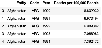
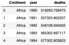
malaria_deaths.csv
df1 = pd.read_csv('malaria_deaths.csv')
df1 = df1.rename(columns={"Deaths - Malaria - Sex: Both - Age: Age-standardized (Rate) (per 100,000 people)": "Deaths per 100,000 People"})
df1.head()
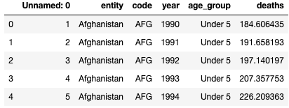
malaria_deaths_age.csv
df2 = pd.read_csv('malaria_deaths_age.csv')
df2.head()
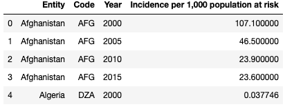
malaria_deaths_age.csv
df3 = pd.read_csv('malaria_inc.csv')
df3 = df3.rename(columns={"Incidence of malaria (per 1,000 population at risk) (per 1,000 population at risk)": "Incidence per 1,000 population at risk"})
df3.head()
Data Visualizations with Seaborn
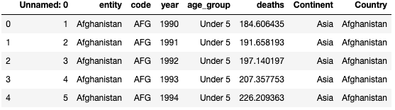
In these datasets, there are totally 228 different countries (‘Entity’) recorded. For simplicity, I decided to divided them into 6 continents which is ‘Africa’, ‘Asia’, ‘Europe’, ‘North America’,‘Oceania’ and ‘South America’. I found another dataset ‘Countries-Continents.csv’ and merged with the dataset ‘malaria_deaths_age.csv’.
df4 = pd.read_csv('Countries-Continents.csv')
df_merge = df2.merge(df4,left_on='entity', right_on='Country')
df_merge.head()
Group by ‘Continent’ and ‘year’ and have a sum on ‘deaths’. Then we have the total number of deaths for a certain Continent in a certain year.
df_total = df_merge[['deaths','Continent','year']].groupby(['Continent','year']).sum().reset_index()
df_total.head()
Line Plot with Seaborn. With yscale = ‘log’ for clear seperations and with plt.xkcd() for fun!
with plt.xkcd():
    fig, ax = plt.subplots(1,1, figsize=(8,5))
    sns.lineplot(data=df_total, x="year", y="deaths", hue="Continent")
    ax.set_title('total deaths over years', fontsize=16)
    plt.legend(bbox_to_anchor=(1.01, 1),borderaxespad=0)
    plt.yscale('log')
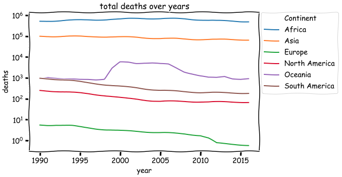
- The total number of deaths due to malaria differs on different continents. From the largest to least: Africa, Asia, Europe, North America, Oceania, South America. The rank has not changed for many years (from 1990 to 2015).
x_axis = ['Under 5', '5-14', '15-49', '50-69', '70 or older']

with plt.xkcd():
    fig, ax = plt.subplots(nrows=1, ncols=1, figsize=(15, 6))
    sns.barplot(x='age_group', y='deaths', data=df2,order = x_axis);
    ax.set_title('age VS deaths over all countries', fontsize=16)
    plt.show()
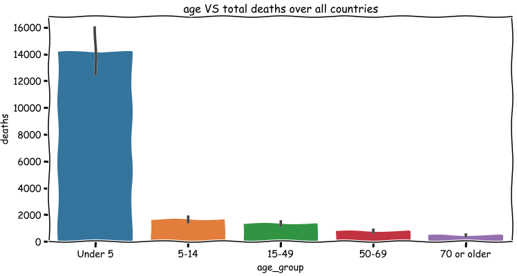
As the figure shown above, it is quite obvious that the total number of deaths for people under 5 is the largest. But we cannot conclude that the people under 5 (children) are much more likely to be dead due to malaria since we have no idea about the situation of infections for each age group. The world wide total number of deaths reduces as the growth of age. However, since we don’t know the populations in different age group, we cannot say that the number of deaths is inversely proportional to the age.
grouped_1 = df1[['Year','Deaths per 100,000 People']].groupby('Year').mean().reset_index()

grouped_3 = df3[['Year','Incidence per 1,000 population at risk']].groupby('Year').mean().reset_index()

with plt.xkcd():
    fig, ax = plt.subplots(nrows=1, ncols=2, figsize=(18, 6))
    sns.lineplot(data=grouped_1, x='Year', y='Deaths per 100,000 People', ax=ax[0])
    ax[0].set_title('Deaths over Years')
    sns.lineplot(data=grouped_3, x='Year', y='Incidence per 1,000 population at risk', ax=ax[1])
    ax[1].set_title('Incidence over Years')
    plt.tight_layout()
    plt.show()
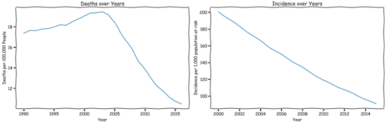
- The death rate of malaria for per 100,000 people first increases and then decreases. 2000 to 2003 is the peak.
- Incidence per 1,000 population at risk decrease over years.